NHS Covid-19 app
This case study describes experience gained by team members across prior roles and engagements.
04/05 All projects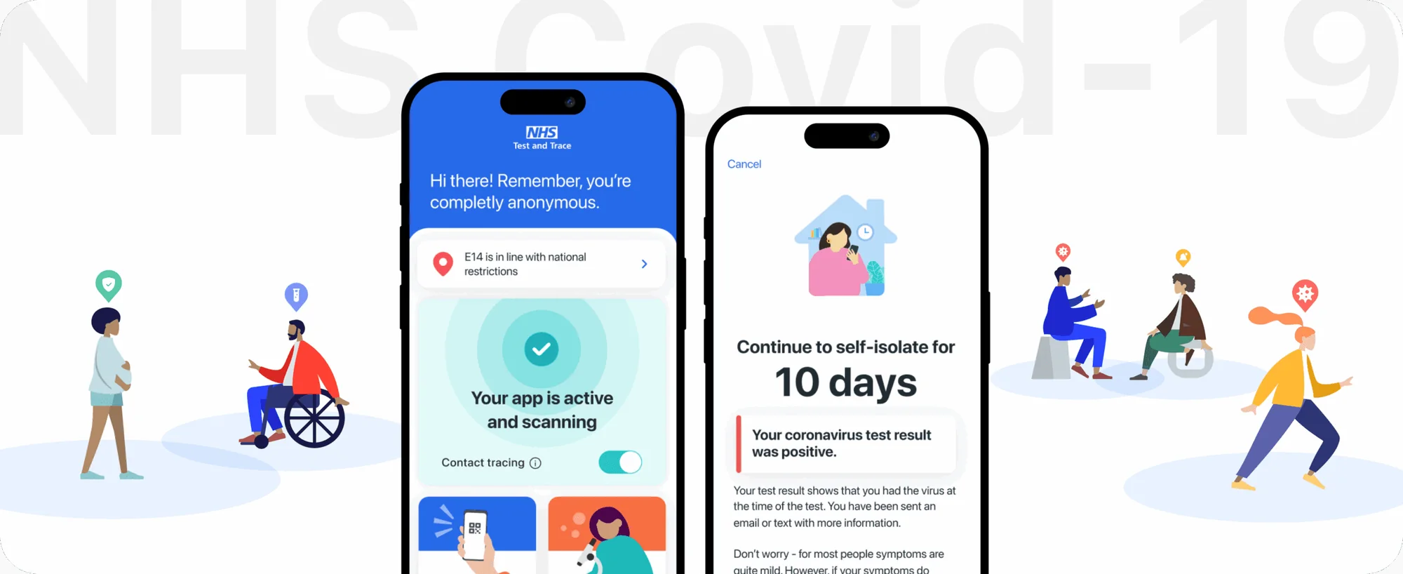
The project
This case study captures experience developed while contributing to a large-scale medical app created to support public health across England and Wales. The application enabled digital exposure notifications and health guidance, helping people respond to evolving medical risks during the COVID-19 pandemic.
The work focused on UX & UI design for medical and healthcare applications, where clarity, accessibility, trust, and privacy were critical. Designing a medical app at national scale required careful balance between speed of delivery, regulatory constraints, and human-centred design.
What we did
Medical app UX/UI, research direction, information architecture, flows, interactions, workshops, prototyping, testing
Impact
600K lives saved
The medical app supported national efforts to reduce infection spread through anonymous exposure alerts.
- 4.8 App Store rating
- Clear communication and usability helped build trust during a public health emergency.
- 30M+ active users
- The experience enabled large-scale adoption by addressing privacy and accessibility expectations common to medical apps.
- Delivered in 6 weeks
- A fully functioning healthcare application was designed and launched under extreme time pressure.
- Privacy-first design
- Health data was handled using privacy-preserving technologies to maintain public confidence.
- Distributed collaboration
- Medical app design was coordinated across multiple countries and time zones.
- Rapid iteration
- Design decisions were tested and refined quickly alongside engineering and research teams.
- Public health support
- Clear alerts and guidance helped users respond appropriately to medical risks.
In use
The product as it was shipped, captured as it renders.
Mission
The goal was to help shape a medical app that people could rely on during uncertain and stressful moments. The experience needed to clearly explain health risks, protect personal data, and guide users through sensitive decisions with empathy and precision.
Key challenges
- Privacy concerns
- Users were wary of tracking and misuse of medical information.
- Trust perception
- Clear distinction between healthcare services and government systems was essential.
- Scale
- The app needed to work for the majority of UK smartphone users.
- Frontline contexts
- Healthcare and essential workers faced unique real-world constraints.
- Accessibility
- The medical app had to serve users with a wide range of abilities.
- Economic impact
- Isolation guidance affected income for many self-employed users.
- Without widespread adoption, the medical app could not deliver meaningful public health impact.
Objectives
- Build confidence in a medical app handling sensitive health data.
- Create onboarding capable of supporting tens of millions of users.
- Communicate health guidance in a calm, reassuring way.
- Reduce friction in actions such as venue check-ins.
- Explain isolation requirements without increasing anxiety.
- Meet high accessibility standards expected of healthcare software.
- Ensure the app could be used without training or external support.
Process
The design approach blended Design Thinking and Lean UX, adapted for healthcare delivery. Methods were selected to support rapid decisions while respecting clinical, legal, and accessibility requirements expected of a medical app.
-
01
Research & insights
Cross-functional sessions brought together UX, engineering, product, legal, compliance, behavioral science, and accessibility specialists. Shared scenarios and storyboards helped align teams around critical medical app journeys.
-
02
Ideation & wireframes
User flows and wireframes were produced for all core features, allowing early validation of complex healthcare interactions.
-
03
Hi-fi designs & prototyping
High-fidelity UI designs were refined through continuous remote testing, with emphasis on privacy understanding and clarity of medical messaging.
-
04
Testing
Rapid usability testing supported frequent refinements as real-world usage patterns emerged.
-
05
Accessibility
Accessibility was embedded throughout the process to ensure the medical app worked for users with diverse physical, cognitive, and situational needs.
-
06
Design system
A cohesive design system helped maintain consistency and speed as the application evolved under intense delivery pressure.
What we learned
Building a medical app at national scale required more than strong UX. Clear communication, public education, and alignment with healthcare messaging were essential. UX and UI design helped translate complex medical systems into experiences people could understand and trust.